Orange Health

Product design for a diagnostics platform — three projects, one goal: make health data feel human.

Senior Product Designer · Consumer squad in a 55-person product & engineering org

Product DesignHealthtech2021–2026

Three chapters

Case study
Neo Report

Diagnostic reports
people actually read

Orange Health's lab results arrived as a 30–50 page A4 PDF. Neo Report turned them into something people open, understand and act on.

Role
Design lead · acting PM
Team
Head of Product · Engineering · QA · Lab team · Doctors
Scope
0→1, problem framing to release

01
The problem

Every result came as a print-formatted PDF — clinically complete, but written for pathologists, not for the person whose blood it describes. On a phone it meant pinching, zooming and hunting through dozens of pages.

02
The insight

People don't read lab reports — they scan them. The first question is never about a specific enzyme. It's simply “is anything wrong?” — and the PDF made that one question the hardest to answer.

03
The answer

Neo Report answers it first: what needs attention, surfaced immediately, with depth — ranges, trends, explanations — one tap below. It took two versions to learn what that meant. V1's survey scores were glowing, but the recordings disagreed: people skipped the summary page, ignored the trend graphs, and happily scrolled the full report instead. So V2 became one scrollable screen — filters to narrow, a drawer for depth.
91%liked V1 in the in-app survey
74%who opened parameter details left without using them
2.7%ever touched the trend graphs
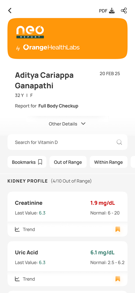
Neo Report v2 — one scrollable screen with search, range filters, and parameter cards each showing its value, last value and normal band
ctx.01 — one screen
search and the range filters narrow it; every parameter carries its last value, its normal band and a trend.
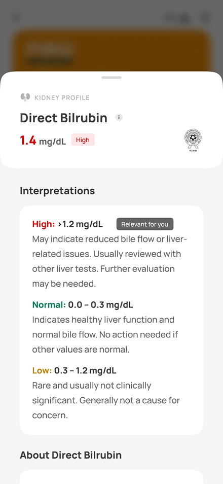
Neo Report detail drawer — a single parameter with high, normal and low interpretation bands, the applicable band tagged relevant for you
ctx.02 — the drawer
depth on tap. every band explained, and the one you fall in marked relevant for you.

04
The rules

  • P.01Trust before delight — a medical document should reduce anxiety, not perform.
  • P.02TL;DR first, depth on demand — nobody reads 40 pages to learn that everything is fine.
  • P.03No compromise on accuracy — simplify the presentation, never the medicine.

05
The outcome

“I don't have to google my out-of-range parameters anymore.”

— user, in-app feedback

Users started leaving the PDF behind — and Neo Report became the foundation for trends, explanations and long-term health context.
Case study
Assisted Purchase

A second way
to order

High-intent visitors were abandoning Orange Health's website — not for lack of interest, but for lack of help. Assisted Purchase turned that help into a sales channel.

Role
End-to-end product design
Team
PM + Head of Product · Engineering · QA
Scope
Order flow — three assist routes

01
The problem

People arrived ready to book, and still dropped off: uncomfortable navigating the site, holding prescriptions they couldn't read, confused by test names, combinations and pricing. Help technically existed — callback, chat, prescription upload — but it lived outside the purchase journey, and almost nobody found it.

02
The reframe

“Users didn't want support. They wanted another way to place an order.”

So assistance stopped being a fallback and became a first-class purchase channel — built for the people who couldn't self-serve, invisible to the people who could. The brief we held ourselves to: convert the first group without adding a single step for the second.

03
The system

Three ways in — callback, WhatsApp chat, prescription upload — implemented on three surfaces, each at the exact moment uncertainty peaks. Contextual, never interruptive: users who could self-serve never saw a detour.

And on the other side of the call, agents got a console with the user's cart, search history, uploaded prescriptions and patient details — because the goal was closing an order, not resolving a ticket.

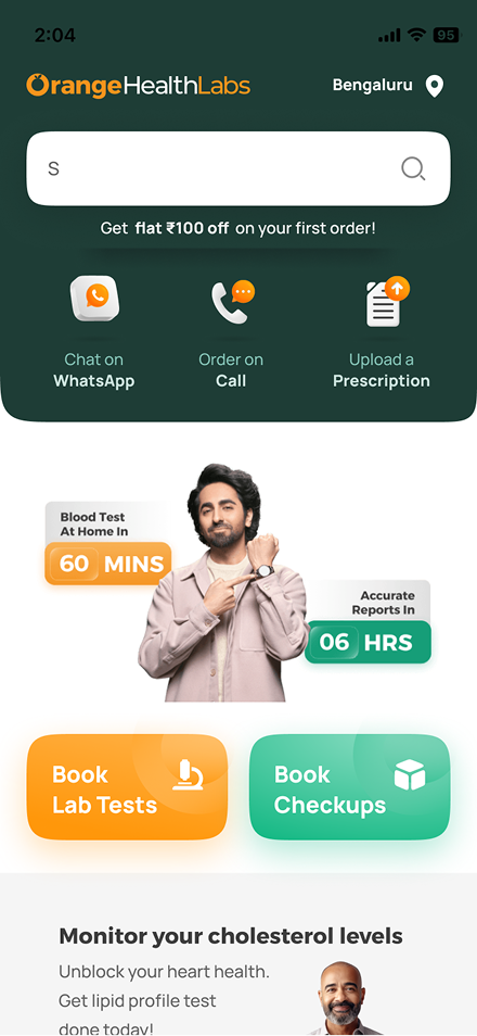
Orange Health homepage with WhatsApp, call and prescription entry points
ctx.01 — homepage
three assisted entries sit beside the regular booking paths, visible from the first screen.
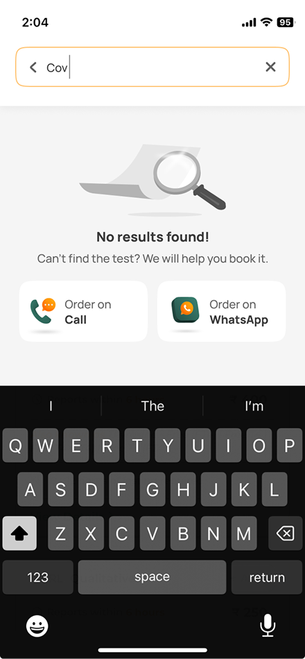
search no-results state offering to order on call or WhatsApp
ctx.02 — search dead-ends
"no results" becomes "we will help you book it" — order on call or whatsapp.
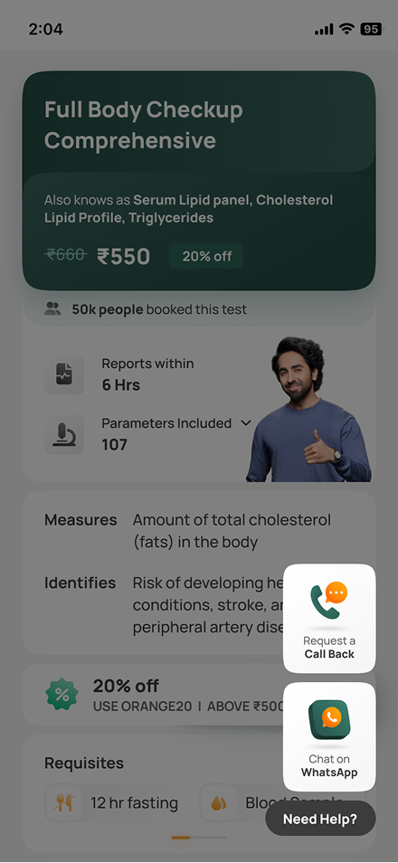
product page with floating need-help callback and WhatsApp options
ctx.03 — product pages
a floating "need help?" offers a callback or chat at the moment of doubt.

04
The impact

+7.4%website conversion rate
34%callback conversion, up from 23%
+2.03%net jump in total web orders

Callback leads grew ~70%, and 63% of them were contacted within ten minutes. The channels added incremental conversions — not cannibalized ones.

Case study
Health Profile

The app's first
reason to return

A 0→1 foundation inside a purely transactional app — the shift from ordering tests and viewing reports toward a place people return to, to understand and manage their health.

Role
End-to-end product design
Team
Head of Product · Engineering · QA · Lab team
Scope
V1 foundations — IA for the health-data features that follow

01
The problem

Most people don't track their health — not because they don't care, but because it's hard and fragmented. Prescriptions live in physical files. Reports are scattered across WhatsApp, email and PDFs. Self-tracked values are inconsistent or lost. And family caretakers manage health for others, not just themselves. Even motivated users give up: the effort outweighs the value.

The real problem wasn't missing features. It was the absence of a single, coherent system.

02
The reframe

“Not a profile screen — a health journal.”

A journal matched how health actually works: continuous, not episodic. Longitudinal, not moment-based. Shared across family members and doctors. That framing guided every decision that followed — the first step toward something people return to as routinely as Apple Fitness, Stoic or Strava, in an app that had only ever been transactional.

03
The system

Health Profile began as a three-axis system — Snapshot, Timeline, Records — and shipped as two. A standalone timeline would have been underpowered, so chronology became a behavior inside Records rather than a screen of its own.

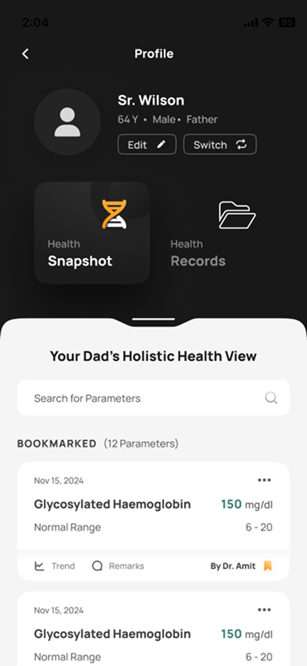
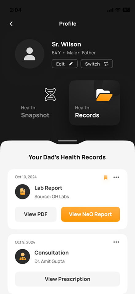
Snapshot answers how someone is doing right now: key markers, condition-relevant parameters, trends where available, values bookmarked by the system, the user or their doctor — designed for clarity, not diagnosis or advice. Records is the unified, time-ordered log underneath: lab reports internal and external, prescriptions, consultation notes, and self-tracked values like BP and blood sugar.

Health Snapshot — a caretaker's view of their father's profile, with bookmarked parameters, values, normal ranges and the doctor who flagged them
ctx.01 — health snapshot
the holistic view — a caretaker checking their father's bookmarked parameters.
Health Records — a time-ordered log of lab reports, consultations and prescriptions, each with its own actions
ctx.02 — health records
the time-ordered log — every report, prescription and consultation in one place.

04
The rules

  • P.01Structure before engagement — V1 deliberately optimized the mental model and data architecture, not discoverability.
  • P.02Clarity, not diagnosis — the snapshot shows how someone is doing; it never advises.
  • P.03Built for caretakers — people manage health for their families, not just themselves.

05
What it unlocked

No engagement numbers here — by design. V1's job was the foundation, and it unlocked what comes next: long-term health tracking, caretaker-centric workflows, future insights and recommendations, deeper integration with reports and consultations — and a clear path toward daily-use engagement.

Next projects

LuminForge Identity Brand Identity — 2026 Krispy Kreme Doughnuts Marketing Design — 2019 Ascending Descending T-Shirt Graphics — 2023